Federal Government

Anonymised · NDA

Improving how citizens find their way to applying for a federal benefit

Federal Benefits Information Redesign case study

Project under NDA

To comply with non-disclosure agreements, all specific geographic names, government branding, and proprietary policy details have been anonymized or generalized. The underlying UX methodologies, structural challenges, and measurable impacts remain entirely accurate.

Project under NDA

To comply with non-disclosure agreements, all specific geographic names, government branding, and proprietary policy details have been anonymized or generalized. The underlying UX methodologies, structural challenges, and measurable impacts remain entirely accurate.

Task completion went from 55% to 97% in moderated testing. As part of a 300-person federal modernisation programme, I worked on a nine-person cross-functional team to redesign the information experience guiding citizens through applying for government benefits. The guidance had grown complex over years of team contributions — citizens were navigating a dense web of pages just to work out whether they qualified and where to begin.

Task completion went from 55% to 97% in moderated testing. As part of a 300-person federal modernisation programme, I worked on a nine-person cross-functional team to redesign the information experience guiding citizens through applying for government benefits. The guidance had grown complex over years of team contributions — citizens were navigating a dense web of pages just to work out whether they qualified and where to begin.

Role

UX/UI Designer

9-person team

Team

Federal benefits service

Anonymised under NDA

Impact

55% → 97% task completion in moderated testing

Redesigned multiple benefit streams of information

Tested across 3 participant cohorts

Plain language, linear structure, clear prerequisites

Role

UX/UI Designer

9-person team

Team

Federal benefits service

Anonymised under NDA

Impact

55% → 97% task completion in moderated testing

Redesigned multiple benefit streams of information

Tested across 3 participant cohorts

Plain language, linear structure, clear prerequisites

The problem

The information was the barrier

Our team owned the information experience — the pages citizens read to learn how to apply, not the form itself. Over years of contributions from many teams, the guidance had become fragmented and hard to follow. Three core problems drove people away before they ever started an application.

Three problems identified

Overwhelming information

The volume and reading level of the guidance exceeded what many users could process — especially first-time applicants and those with cognitive disabilities.

Looping behaviour

Analytics showed people bouncing back and forth through the same pages without making progress — a clear signal that the path forward was not visible.

Unclear prerequisites

It wasn't clear what documents were needed before starting — people began the process, stalled, and left to search for information they should have had upfront.

Research & discovery

Mapping where people got lost

Before proposing solutions, we built evidence through three sources. The same problems kept surfacing across all of them — confirming these were systemic information issues, not isolated page problems.

Research methods

Adobe Analytics

Path data showed people hunting back and forth across pages — the information wasn't where they expected it, so they navigated back and forth instead of moving forward.

Adobe Analytics

Path data showed people hunting back and forth across pages — the information wasn't where they expected it, so they navigated back and forth instead of moving forward.

Journey mapping

Mapping the end-to-end experience exposed where people stalled — unsure which benefit applied, whether they qualified, or what they needed before starting.

Prior research review

Reviewing past research from other teams on the same programmes surfaced the same recurring problems — systemic information issues, not isolated to one page.

Citizen journey map — the information experience before redesign

Composite citizen journey map for finding benefits.

Usability testing

55% → 97% — what the sessions revealed

We ran multiple rounds of moderated testing before and after the redesign across three cohorts: two distinct applicant cohorts and participants with cognitive disabilities. Testing all three mattered — each surfaced friction the others missed, and the cognitive-disability cohort exposed comprehension barriers that standard testing alone would have overlooked.
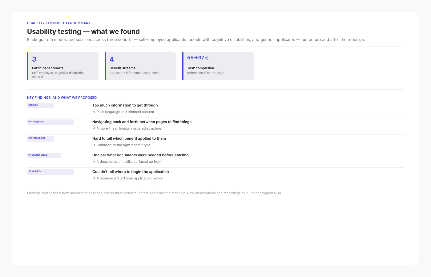
Usability testing findings: key findings and proposed solutions.

What the sessions found

Information overload

Volume and reading level were the dominant barrier — people couldn't quickly find what applied to them, so they read everything and still left unsure.

Back-and-forth navigation

People bounced between pages hunting for a required form or eligibility detail — because it wasn't where they expected it, the next step was rarely clear.

Unclear prerequisites

People didn't know which documents they needed before beginning. Many started, hit a wall, and left to find them — and not all came back.

Cognitive accessibility

Participants with cognitive disabilities faced heightened barriers — dense reading levels, no clear path, and the lack of a visible starting action all compounded.

The redesign

A clearer, more linear path through the information

Working within the established government design system, the redesign focused on three principles. The before/after diagram and representative wireframes below show the structural shift — from scattered, volume-heavy pages to a focused, step-by-step information flow.

Information structure — before and after the redesign

Anonymized under NDA

The information architecture diagram has been removed to comply with NDA requirements. Full documentation — including the before/after structure — is available on request.

Representative wireframes — program overview, eligibility screening, and pathway selection

Anonymized under NDA

Representative wireframes have been removed to comply with NDA requirements. The full wireframe set — covering program overview, eligibility screening, and pathway selection — is available on request.

Plain language

Content was rewritten to a clear reading level, removing jargon and passive constructions that slowed comprehension — particularly for those reading under cognitive load.

Plain language

Content was rewritten to a clear reading level, removing jargon and passive constructions that slowed comprehension — particularly for those reading under cognitive load.

Linear structure

Pages were restructured so citizens moved forward through the information in a logical sequence, rather than needing to navigate back and forth to assemble what they needed.

Linear structure

Pages were restructured so citizens moved forward through the information in a logical sequence, rather than needing to navigate back and forth to assemble what they needed.

Prerequisites upfront

Required documents and eligibility criteria were surfaced at the start of each benefit section, so people could prepare before beginning rather than discover blockers mid-journey.

Outcomes

Designing for clarity, not just compliance

What changed — and what we learned

The 55% to 97% task completion improvement was measured in moderated testing. In quarterly programme reviews attended by around 300 stakeholders, findings were presented screen-by-screen, ranked by severity, paired with a recommendation, and backed by session recordings. Prototypes replaced written descriptions as the primary communication tool — stakeholders could see the problem and the solution in the same sitting. Given more time, I would track completion through the live site in production, run a larger dedicated cohort for cognitive-disability testing, and revisit the language at the start of the benefit hub where the highest drop-off occurred.

Impact

55% → 97% task completion

Citizens who could previously navigate to the start of an application in around half of moderated sessions could do so in nearly all sessions after the redesign.

55% → 97% task completion

Citizens who could previously navigate to the start of an application in around half of moderated sessions could do so in nearly all sessions after the redesign.

Accessibility-led content strategy

The cognitive-disability cohort's feedback directly shaped language decisions — testing with this group wasn't a checklist item, it was the signal that drove the clearest rewrites.

Accessibility-led content strategy

The cognitive-disability cohort's feedback directly shaped language decisions — testing with this group wasn't a checklist item, it was the signal that drove the clearest rewrites.

Prototypes as stakeholder tools

In 300-person programme reviews, showing a session clip alongside a prototype of the fix was more persuasive than written reports — it compressed the gap between problem and solution.

Prototypes as stakeholder tools

In 300-person programme reviews, showing a session clip alongside a prototype of the fix was more persuasive than written reports — it compressed the gap between problem and solution.

Create a free website with Framer, the website builder loved by startups, designers and agencies.