ServUS Health
2018
Designing a community health platform that connects caregivers, seniors, and service providers across New Brunswick
A community care platform built for New Brunswick
Role: UX/UI Designer · Duration: 3–4 Months · Year: 2017–2018 · Engagement: Freelance · Startup

Problem area
No single place to coordinate care for aging loved ones
Families caring for aging parents face a tangled coordination challenge — multiple providers, scattered government programs, distributed family members, and no single place to bring it all together. To understand the people behind that challenge, I attended several New Brunswick health and senior care trade shows alongside the founder before any pixel was drawn.
The coordination gap
Research & personas
Three users, three completely different needs
The founder provided qualitative research from conversations with caregivers, seniors, and service providers across the New Brunswick care community. To deepen my understanding, I attended several health and senior care trade shows alongside her — talking directly with the people I was designing for about what their day-to-day actually looked like.
Those conversations didn't replace formal usability research, but they grounded every design decision in something real. I synthesised everything into three personas spanning a 52-year age gap — from Mark's high tech confidence to Mary's low confidence, with Diane's provider-side business needs in between.
What the trade shows revealed
Coordination was everyone's pain point
Caregivers weren't struggling to find individual services — they were struggling to manage them all at once with no shared system.
Seniors wanted independence, not hand-holding
The consistent ask wasn't more features — it was simpler access to existing ones, without needing family to navigate for them.
Providers had no reliable way to reach families
Home care companies relied on word of mouth and missed calls. There was no directory that worked for both sides of the connection.
The three personas
Mark White · Caregiver
55, full-time professional managing his father's Alzheimer's care. Needs a dashboard that surfaces updates instantly and connects him to the whole care team without switching apps.
From insight to architecture
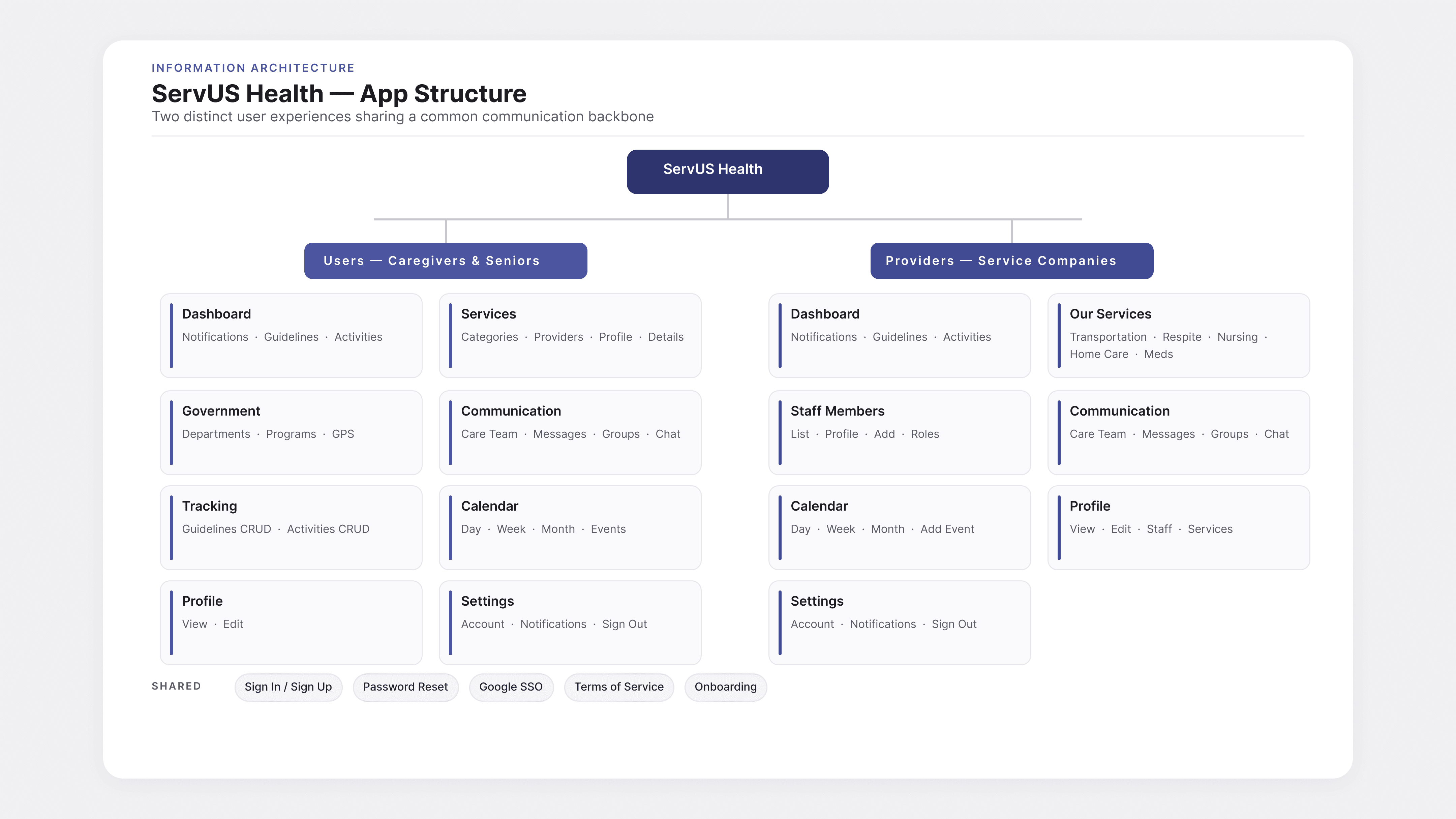
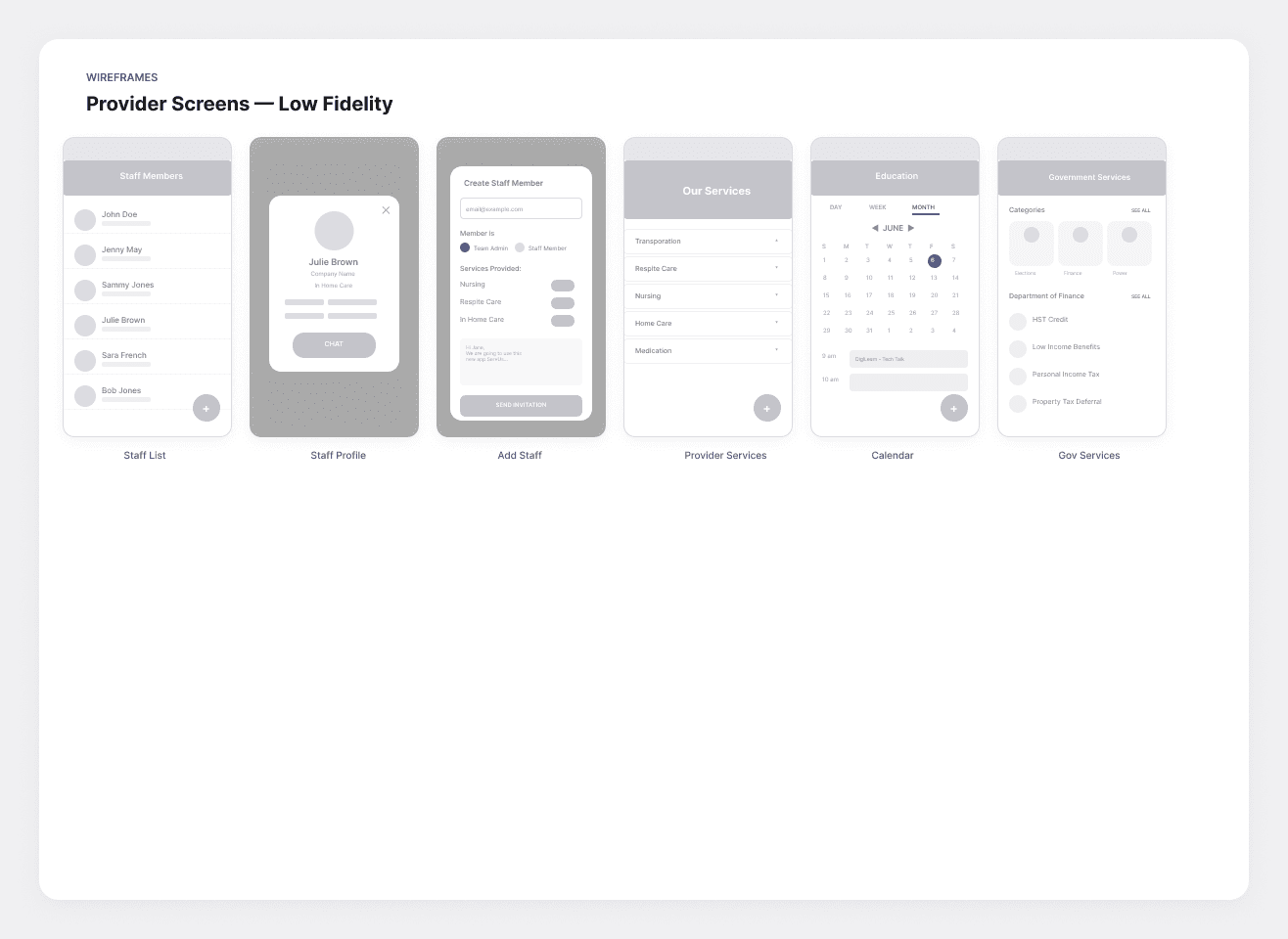
Each persona generated a task analysis and user stories. From there I built a complete information architecture for both sides of the app — caregivers/seniors on one side, providers on the other — and a full wireframe set before moving to high fidelity.
Wireframes — Provider screens

Wireframes — Caregiver & Senior screens
Persona 01 · Mark White, Caregiver
A caregiver who needs to know what changed today
The platform had to answer one question instantly: what changed in Dad's care since I last checked? Mark is 55, working full-time, and managing his father's Alzheimer's care alongside two siblings and a rotating cast of home care workers. He opens the app on the bus, between meetings, and after dinner — never with focused attention.
Mark's journey map
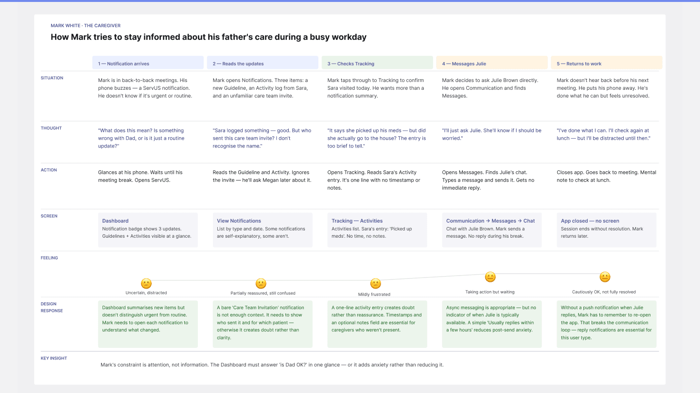
The map surfaced four high-frequency moments: notification arrives → reads the update → checks tracking → messages the worker. Every screen behind those moments needed to be lightweight, glanceable, and trustworthy.
A four-step walk through
Step 01 · Notification arrives

Step 02 · Reads the updates
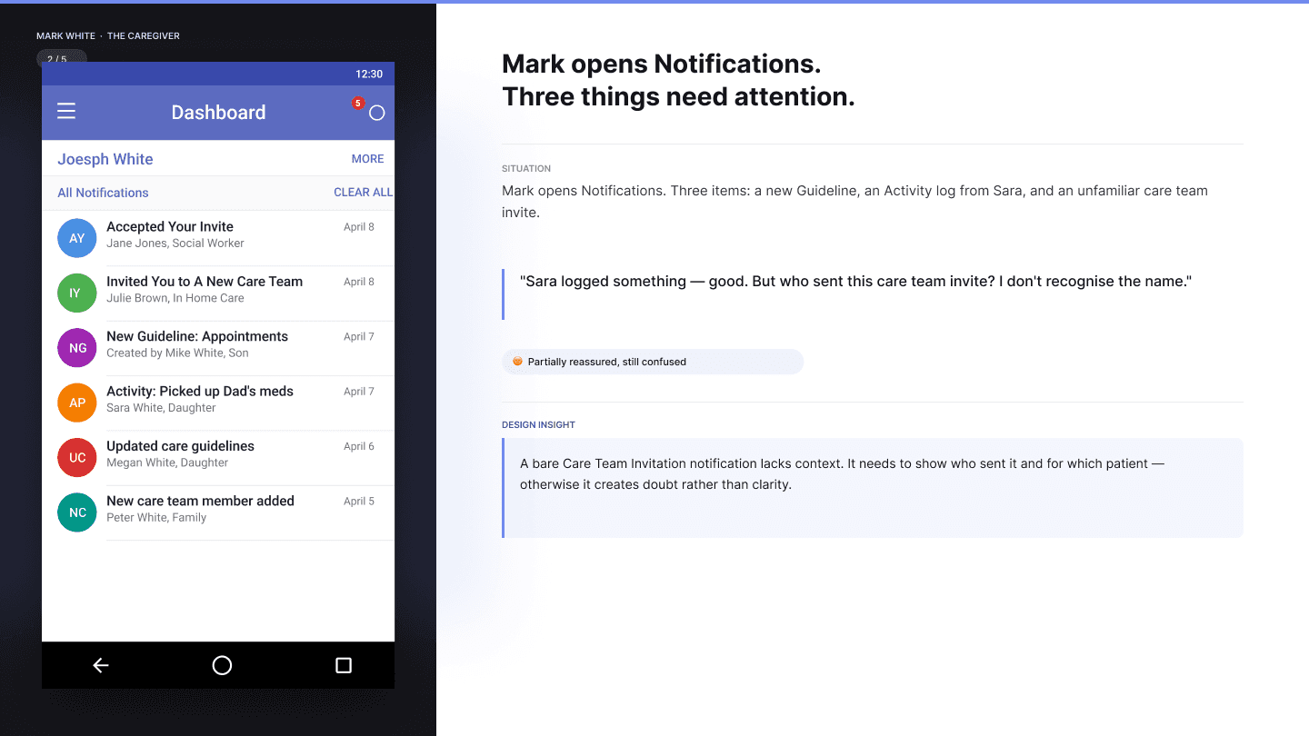
Step 03 · Checks tracking

Step 04 · Messages Julie

Before & after — Activity entries

What Mark's journey taught me
The dashboard had to behave like a status board, not a feed. Recent activity, active guidelines, and assignable people all needed to be visible without scrolling. The Tracking section gave Mark a daily “is everyone on the same page” check, and the Care Team grid meant he could message the right person in one tap — no contacts app, no looking up phone numbers, no friction at the moment of need.
Persona 02 · Mary Green, Senior
A senior who has to be able to do this without help
If the platform asked Mary to do anything she didn't already know how to do, she would simply stop using it. Mary is 78, a widow, and recovering from a broken hip. She uses her phone for phone calls and email occasionally. She does not download apps.
Mary's journey map

The map traced three moments: open the app → find a service → feel confident contacting the provider. Every one needed to feel safe.
A three-step walk through
Step 01 · Opens the app

Step 02 · Finds services

Step 03 · Views providers

Before & after — Dashboard

What Mary's journey taught me
No icon-only navigation. Generous touch targets. Plain-language labels — “Find services” not “Directory”. Headers that match where you tapped. The Services directory and Government programs sections were specifically restructured around category browsing rather than search, because Mary doesn’t know what she’s looking for — she knows what kind of help she needs.
Persona 03 · Diane Little, Provider
A provider running a business that has to keep moving
Diane's side of the platform had to feel like a real business tool: dense, fast, and full CRUD. She's 26 and runs a home care company in Fredericton with twelve staff. Her Monday admin blocks — onboarding new hires, updating service listings, reconciling the calendar — are exactly the kind of work that a consumer-grade UI breaks down on.
Diane's journey map

The map zoomed in on a recurring Monday morning admin block: clear the pending action queue → add new staff to the system. Both had to be efficient, interruption-tolerant, and draft-friendly.
A two-step walk through
Step 01 · Monday admin block

Step 02 · Adds new staff

Before & after

What Diane's journey taught me
Staff, Services, and Calendar all use the same CRUD pattern: list → detail → add/edit/delete. Learn it once, use it everywhere. The decision saved Diane time, but more importantly it gave the development team a single component model instead of three. Provider-side dashboards also surface a Pending Actions queue first — because what Diane needs on a Monday morning is not a chart, it's a list of things waiting for her decision.
The shared system
One communication backbone — both sides of the app
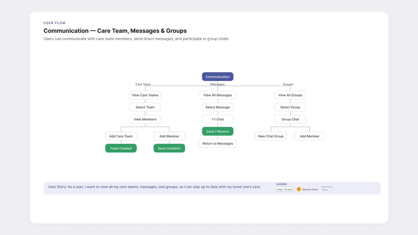
Three personas, three different experiences — but only one app. The hardest design problem was figuring out what belonged to each side and what they shared. The answer was Communication. Care Team, Messages, and Groups are identical for caregivers and providers. When Mark opens a chat with Julie, his home care worker, they are both inside the same interface — same conventions, same status indicators, same patterns. That single shared system is what made the split-personality architecture work.
Care Team, Messages & Groups — shared across both user types
The dashboard as a care coordination hub

Both dashboards answer the same question — "what changed since I was last here?" — but surface different content. Mark sees activity for his father; Diane sees pending actions across her business. Same shape, different content. The See All pattern was intentional: most-recent items inline, full history one tap away.
Retrospective
End-to-end UX ownership across a dual-audience platform
Designing for Mark, Mary, and Diane simultaneously — three people with completely different relationships to technology, different emotional contexts, and different definitions of success — forced me to think about UX in a way that a single-persona product never does. The thing I'm most proud of is the Communication system: the decision to make it the shared backbone means that when a caregiver and a home care worker open a chat, they are in the same space. If I were doing this project today, I'd advocate for usability testing with seniors early — Mary's persona was research-informed, but I'd want to validate those assumptions before committing to the layout.

By the numbers
3 research-grounded personas
Informed by NB health trade shows and founder interviews — spanning a 52-year age gap and every level of tech literacy
1 shared communication backbone
Care Team, Messages, and Groups unified across both user sides — caregivers and providers in the same interface

