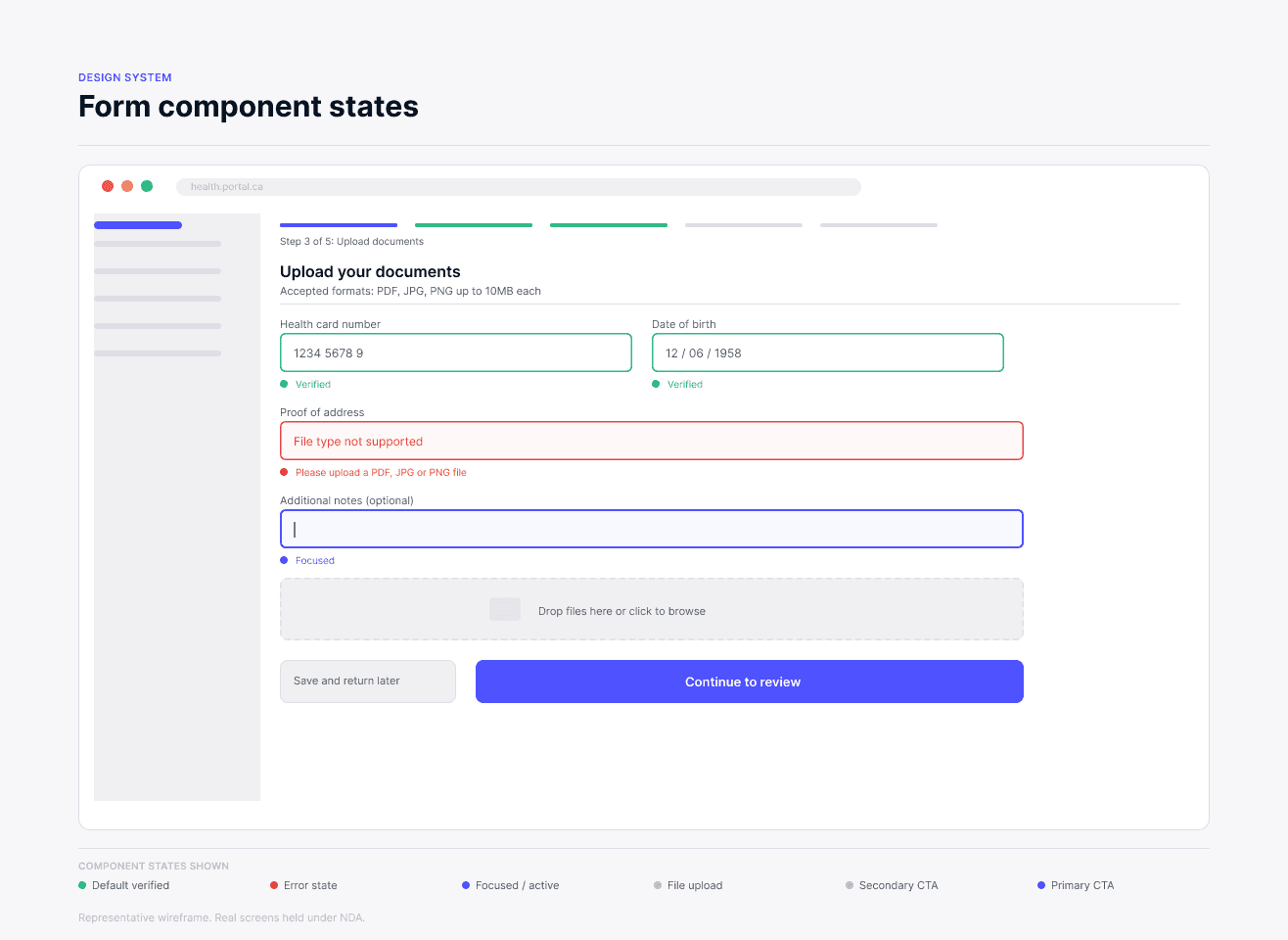
To comply with non-disclosure agreements, all specific geographic names, government branding, and proprietary policy details have been anonymized or generalized. The underlying UX methodologies, structural challenges, and measurable impacts remain entirely accurate.
Overview
Two portals serving residents and administration staff, built from scratch
Senior UX/UI designer across a two-year CGI engagement building two WCAG AA-compliant provincial health portals from scratch — one for residents submitting applications, one for administration staff managing programs and processing. Worked closely with BAs, developers, QA, and accessibility specialists throughout, with two additional designers contributing during specific periods.
Role
Senior UX/UI Designer
CGI · BAs, devs, QA, accessibility
Team
Provincial health portals
Confidential · 2022–2024
Impact
100+ screens across resident + admin portals
40+ component design system, contributed upstream
WCAG AA compliance across both portals
3 rounds of usability testing with 20+ residents
Role
Senior UX/UI Designer
CGI · BAs, devs, QA, accessibility
Team
Provincial health portals
Confidential · 2022–2024
Impact
100+ screens across resident + admin portals
40+ component design system, contributed upstream
WCAG AA compliance across both portals
3 rounds of usability testing with 20+ residents
Designed 100+ screens across a resident portal and an admin portal, mapping complex policy flows into step-by-step guided digital experiences.
Built a 40+ component design system extended from the UK Government Design System.
Partnered with accessibility specialists to audit and remediate barriers across both portals, achieving WCAG AA compliance throughout.
Ran 3 rounds of usability testing with 20+ residents on the resident portal, turning findings into prioritized, evidence-backed design changes.
Forms and Content Structure
From paper forms to guided digital flows
The core goal was replacing paper-based provincial health forms with guided digital experiences. We structured complex applications into multi-step flows with progressive disclosure, inline validation, and clear error states — breaking information-dense pages into manageable steps so residents only saw what they needed at each point. A consistent library of form components scaled across 100+ screens and multiple programs. Policy-heavy content was simplified in partnership with the client, though some regulatory language had to remain.
Before and after: paper process vs guided digital flow
Usability Testing and Feedback
Validating with residents — 3 rounds, 20+ users
We ran iterative usability sessions on the resident portal throughout the build, planned with BAs, with findings fed directly into QA acceptance criteria — not just design revisions. Key findings: residents abandoning registration due to a 15-character password requirement; documents needed mid-flow but not surfaced upfront; no ability to save progress and return (a technical constraint we mitigated by surfacing requirements before starting); and policy-heavy language that was difficult to understand, simplified where legal constraints allowed.
Finding prioritization matrix
Design System and Handoff
Scalable documentation across a two-year build
A 40+ component design system — built to UK Government Design System standards and later contributed upstream — served as the single source of truth across both portals. High-fidelity prototypes aligned cross-functional teams and validated complex conditional logic before development. We partnered with accessibility specialists to audit and remediate barriers, achieving WCAG AA compliance across the resident portal. Clear documentation of workflows, interaction states, and design decisions kept developers, QA, and BAs aligned across the full engagement.
Design-to-development handoff workflow
Retrospective
What this engagement taught me about designing at scale
The work that moved the needle most wasn't pixels — it was building trust with BAs and developers early, so design decisions landed in QA acceptance criteria rather than getting lost between handoff and release. The 15-character password finding is a good example: surfacing it clearly in a prioritization matrix meant it was treated as a blocker, not a suggestion. The no-save-progress constraint couldn't be fixed technically, but surfacing required documents upfront reduced abandonment — design around the constraint, not against it. If I were doing this again, I'd push harder for usability testing on the admin portal. Most sessions focused on the resident side, but staff had friction points we addressed reactively rather than proactively. The design system contribution back to the UK Government Design System was one of the most meaningful outcomes of the engagement.
Full accessibility compliance achieved, validated with Axe, WAVE, and Lighthouse in partnership with specialist auditors.
Usability testing with 20+ residents across 3 rounds fed directly into QA acceptance criteria — not just design revisions.
40+ component library built to UK Gov Design System standards — components contributed back and in use beyond this engagement.
Resident portal and admin portal delivered across a full two-year engagement with BAs, developers, QA, and accessibility specialists.