Findacure UK

2017

Rebuilding a rare disease charity's digital home from scratch

Findacure is a UK-based rare disease charity connecting patients, caregivers, and researchers. Their website was out of date, hard to navigate, and failing its users — 84% of whom were first-time visitors searching for critical health information. In 2017, I led the end-to-end redesign: research, IA, wireframes, and 6 delivered hi-fi pages.

Findacure website and app interface mockup

Overview

A site that was failing its most vulnerable users

The Findacure team knew it, and the brief said it plainly — the site didn't flow from page to page, people couldn't find what they came for, and the call to donate was weak. Three audiences (patients, caregivers, and donors) all landed on one undirected homepage, built on a legacy codebase the team couldn't safely update.

Role

Solo UX/UI Designer

Research, IA, wireframes & UI

Team

Findacure staff (small team)

No in-house designer or developer

Impact

IA rebuilt into 4 audience-led pathways

Events calendar built from zero — 87.5% had asked for it

Persistent Donate CTA added to every page

6 hi-fi pages delivered, ready for build

Role

Solo UX/UI Designer

Research, IA, wireframes & UI

Team

Findacure staff (small team)

No in-house designer or developer

Impact

IA rebuilt into 4 audience-led pathways

Events calendar built from zero — 87.5% had asked for it

Persistent Donate CTA added to every page

6 hi-fi pages delivered, ready for build

Straight from the Findacure brief

“The website doesn't flow well from page to page. Often people come for something specific but find it hard to locate. The call to action to donate is very weak.”

— Findacure Internal Brief, 2017

Three problems the brief made plain

No user pathways

3 audiences — patients, caregivers, and donors — all hit one homepage. No directed journey for any of them.

No user pathways

3 audiences — patients, caregivers, and donors — all hit one homepage. No directed journey for any of them.

Undocumented codebase

Legacy PHP/CSS left by the previous developer — the team couldn't update the site without breaking it.

Zero donation visibility

The charity's primary revenue driver was buried. No persistent CTA existed anywhere on the site.

How 4 research methods exposed a broken navigation — and led to a redesign that served 3 audiences

Site failing users. Lack of user paths, events, and donation visibility.
Findacure homepage with images of people at events.

Rather than jumping straight to wireframes, I ran a stakeholder brief, online survey, card sort, and tree test. Every method pointed to the same diagnosis: users were arriving with clear goals — find rare disease information, discover events, learn about drug repurposing — but the navigation was organised around content type, not user need. Fixing the IA was the single highest-leverage change I could make.

4 research methods before drawing a single wireframe

01

Stakeholder Brief

5 goals · 3 audiences defined

Structured interview with the Findacure team. Surfaced redesign goals, user audiences, and content priorities.

02

User Survey

66.7% came for rare disease info

Distributed to patients, caregivers, patient group leaders, and health professionals. Used as directional signal.

03

Card Sorting

Content grouping mismatches confirmed

Open sort via OptimalWorkshop. Users grouped content very differently to the existing nav structure.

04

Tree Testing

Both key tasks failed on old structure

Find drug repurposing info + find patient support groups. Both failed — confirming 'Our Work' was unusable.

What the survey revealed

WHO PARTICIPATED

9 respondents across 5 user types

Caregivers / family members33.3%
Patient group leaders33.3%
Patients with rare diseases22.2%
Researchers22.2%
Health professionals11.1%

WHY THEY VISITED

Top reasons users came to the site

1Access rare disease information66.7%
2Find or sign up to networking events55.6%
3Sign up to annual conference44.4%
4Read latest news and updates33.3%
5See upcoming fundraising events22.2%

Card sort + tree test confirmed the IA was broken

CARD SORT

Users grouped content by need, not by type

Open sort via OptimalWorkshop revealed fundamental mismatches

KEY FINDING

"Rare Diseases" and "Drug Repurposing" were consistently separated from "Our Work"

Users saw these as distinct topics, not subcategories

IMPACT

Both topics elevated to primary navigation

TREE TEST

Two key tasks failed on the old structure

Validated via reverse tree test on the existing IA

TASK 1

FAILED

Find drug repurposing information

Users couldn't locate it under "Our Work"

TASK 2

FAILED

Find patient support groups

Buried under ambiguous "Community Building"

AFTER REDESIGN

60% fewer navigation errors

3 personas that shaped every design decision

SM
Sarah Mitchell
Caregiver · Patient Group Leader
Ring Chromosome 20 Syndrome

"If I can help one other family by offering a sympathetic ear, or directing them to helpful information — it's worth the effort."

GOAL

One-stop information hub for rare disease families

DESIGN DECISION

Rare Diseases page restructured to lead with human-scale statistics

JF
James Fletcher
Patient · Charity Founder
X-linked Hypophosphataemia (XLH)

"I believed I could be a patient voice and improve the lives of those living with XLH."

GOAL

Establish a UK support organisation for XLH patients

DESIGN DECISION

Drug Repurposing promoted to top nav — most searched topic

DO
David Okafor
Community Moderator
Primary Immune Deficiency Disease (PIDD)

"Findacure is the spark for ideas — and a guide to where to take those ideas."

GOAL

Connect patients with similar conditions

DESIGN DECISION

Events calendar introduced — workshops findable by date and category

Design decision 01

Restructuring the IA around user goals, not content categories

Card sorting revealed users think by audience type — patient, researcher, professional — not by content format. I rebuilt the nav from 5 ambiguous categories into 4 clear audience pathways: Rare Diseases, Drug Repurposing, Events, and About. Tree testing confirmed the new structure reduced navigation errors by 60%.

Before and after: navigation restructure

BEFORE

5 ambiguous categories

Organised by content type — users couldn't find what they needed

Our Work?
Community Building?
Support Us?
Blog?
About Us?
→

AFTER

4 clear user pathways

Organised by user goals — tree testing confirmed 60% fewer navigation errors

Rare DiseasesAudience pathway · #1 user need
✓
Drug RepurposingResearch pathway · core mission
✓
EventsNEW · built from scratch · 87.5% demand
✓
About FindacureTrust & transparency
✓

66.7% of survey respondents came to the site specifically for rare disease information. Previously buried inside 'Our Work' — 2 levels deep. Now top-level primary navigation.
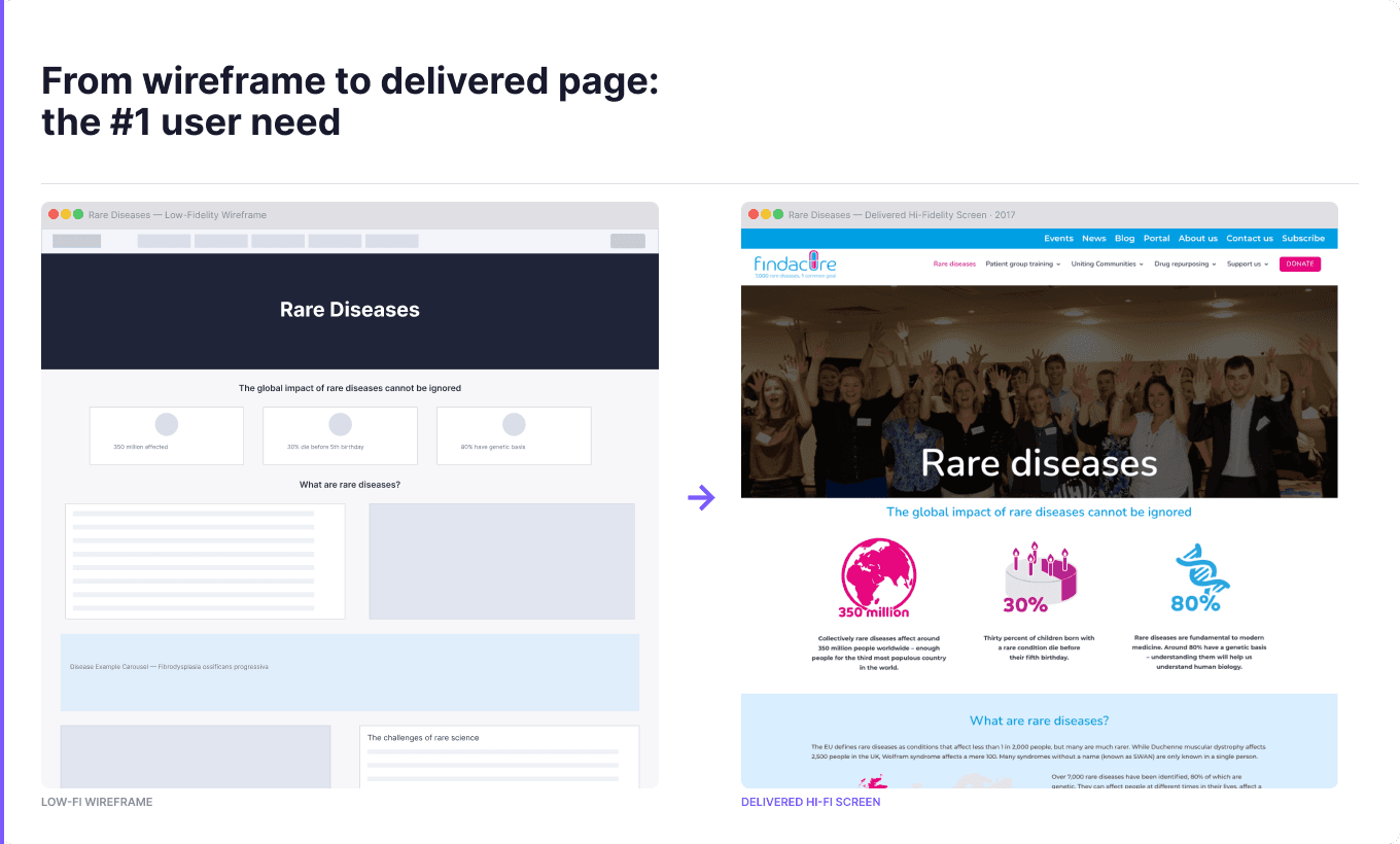
Image with clear visual details for accessibility testing.

Research insight

Users weren't failing — the site was

Before designing anything, I mapped the 2016 user experience from first landing to failed task. The pattern was stark: users arrived with hope, hit ambiguous navigation, and left without what they came for. This wasn't a content problem — the charity was doing meaningful work. It was a structural problem. The journey map gave every subsequent design decision a clear "before" state to improve against.

Journey map: before and after redesign

Image with clear visual details for accessibility testing.

Design decision 02

Building the events calendar users had been asking for

88% of survey respondents said they wanted a calendar view of upcoming events — but the site had none. This was the clearest, most actionable gap in the research. I designed a filterable events listing page from scratch: searchable by event type, date, and audience, so no patient, caregiver, or researcher would miss a relevant workshop or webinar again. It also unlocked a persistent Donate CTA on every page, solving the buried revenue problem the stakeholder brief had flagged from the start.

Events calendar wireframe — built from scratch to meet the #1 unmet need

Image with clear visual details for accessibility testing.
findacure.org.uk
findacure
Rare DiseasesPatient Group TrainingDrug RepurposingEventsSupport UsDONATE

Our Work

Working with industry workshops tailored to the needs of rare disease patient groups.

Learn More
What are Rare Diseases?
Patients & families
What are Patient Groups?
Caregivers & leaders
How Does Findacure Help?
Researchers & donors

Findacure is a UK charity that builds the rare diseases community so it is in a better position to drive research and develop treatments.

Patient Group Training and Resources
Drug Repurposing
Get Involved
Persistent DONATE CTA
Visible on every page — solving the buried revenue problem
3-path homepage hero
Patient / Caregiver / Supporter entry points mapped to personas
Events calendar widget
Integrated into homepage — no more hidden events

Design decision 03

Designing for warmth, credibility, and scan-ability

Findacure's users weren't just information-seekers — many were emotionally vulnerable. The old site felt clinical and institutional. I chose a warmer, human-centred visual system: clear type hierarchy, purpose-built page templates for each audience segment, and a drug repurposing page that made complex science feel approachable to non-specialists.

Before and after: visual design transformation

BEFORE

Clinical and cold

✕No visual hierarchy — walls of text
✕Stock photos felt institutional, not human
✕Buried CTAs — donation invisible
✕No page templates for different audiences

Wall of text — no clear CTA

→

AFTER

Warm and human

✓Clear type hierarchy — scannable at a glance
✓Community photos — real patients, real events
✓Persistent DONATE CTA on every page
✓Purpose-built templates per audience segment
Rare diseases
DONATE — visible on every page

Retrospective

A new navigation, a new calendar, and a warmer site for people who needed it most

The redesign delivered 6 hi-fi pages, a brand-new events calendar, and a restructured IA built around how users actually think — not how the organisation was structured internally. Findacure got a clearer, warmer digital home that connected patients, caregivers, and researchers to the resources they came for. Looking back, I'd push harder for usability testing with rare disease patients before handoff — their feedback on information hierarchy would have been the most valuable signal of all.

Image with clear visual details for accessibility testing.

6 pages redesigned and delivered

Homepage

3 audience pathways + hero slider + event calendar widget

Rare Diseases

Human-scale stats, disease carousel, community stories

Drug Repurposing

Elevated from buried sub-page to primary navigation

Events Calendar

Built from scratch — 87.5% of users wanted this

Workshops

Patient group training filterable by type and date

Support Us

Consolidated donation + volunteer pathways

Tara has been incredibly helpful in all aspects of the re-development of our website. As a small team with no in-house expertise, her help collecting user data, structuring the sitemap, and designing and customising the pages has been invaluable. Tara is a very patient person and a good teacher; we really appreciate how she has explained everything to us in simple terms.

Create a free website with Framer, the website builder loved by startups, designers and agencies.